Expert advice made easy: here at Flame Tree we create, design and edit a wide range of calendars, diaries, illustrated books and ebooks. Sometimes we make artwork ourselves, or commission it from artists, or search through picture libraries. However, for classic licenses like Rupert the Bear we have to find the originals ourselves, clear the copyright, scan them and clean them up. We've been doing this for over 20 years.
Rupert Bear has become somewhat of a classic, and has built up a sizeable and rather dedicated following over the years. As a result, many Rupert fans are keen to get their hands on merchandise featuring this wise and thoughtful chap and his host of colourful animal friends. Little do they know, creating these shiny, new products isn't always straightforward and can require some amount of tweaking and cleaning up of the original Rupert images, which were collated into annuals cherished by hoards of children.
I spoke to Jane (Ashley), a designer at Flame Tree and life-long Rupert fan, about how she chooses and cleans up Rupert images ready for use in our Flame Tree calendars and Flame Tree diaries.
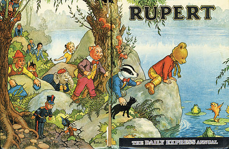
1. Choosing the image – Firstly Jane scours through her considerable collection of old Rupert annuals to find an image she thinks might work. She is looking for a good all-round picture which is large enough that it can be wrapped around a diary cover, including the spine, such that for each year the cover image of the calendar and diary are matching. Jane is of course looking for an image where Rupert is clearly the centre of attention, but is accompanied by a decent number of his loyal buddies. In this case she went for the cover of the 1969 annual, and scanned it in ready to start the clean-up work in Photoshop.

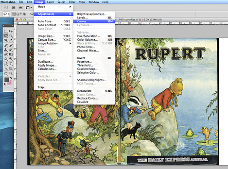
2. Correcting the colours – Having lovingly selected her image, Jane begins the clean-up process with a touch of colour correcting. To do this she selects the 'Curves' tool from the 'Adjustments' menu...
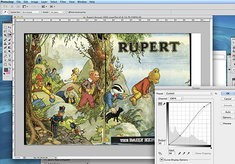
...and alters the curve to make the colours sharper and smoother, experimenting a little to get a good balance which ensures that Rupert and friends look their best (screen shots of this are shown below).
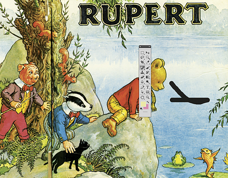
3. De-wrinkling – Next, Jane gives Rupert a bit of a facelift by using the 'Spot Healing' tool to clean up any uneven lines on the images which may have arisen through the aging process. In particular she looks for any subtle unwanted lines resulting from creases on the pages – yes, books get wrinkles too! In the screenshot below the large black smudge shows where Jane stroked her magic healing tool.
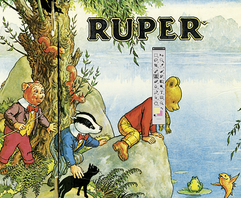
4. Removing the text – So that the image can be used as a calendar or diary cover, rather than still looking like an annual cover, Jane removes the pre-existing text. To do this she uses the 'Cloning' tool, which covers up the text with the same colours and textures as the surrounding image – pretty magical! Below you can see Jane cloning away the 'T' from 'Rupert'.
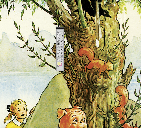
5. Bye bye spine – Finally Jane takes her magic cloning tool to work on that unsightly black line running through the image (a result of where the spine was in the original annual). This part can be tricky to get right and Jane is careful to make sure that she matches the colours and patterns convincingly. The screen shot below shows the cloning work which Jane did on the top squirrel – just compare him to how he looks in the previous screen shot... he is no longer having his head cut off by that black line!
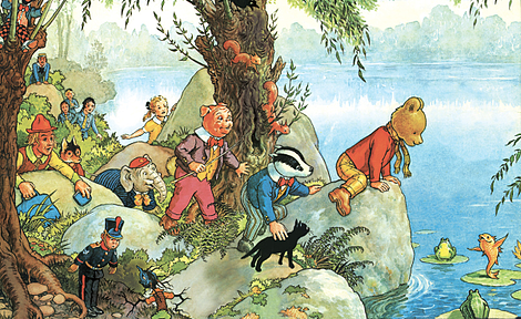
And there you have it – a shiny new Rupert image. See the 'after' shot below, all cleaned up and ready to be used for calendar and diary cover images. Good work Jane!
-
For some cool tutorials on Photoshop, take a look at Youtube here.
-
For information on the copyright / licensing of Rupert and others, here.
-
Great reviews of our Rupert Calendars on Amazon (Thank you!), here.
We'll be sharing some more techniques and tips over the coming months. Let us know below if you have any areas you'd like covering. Thank you.


