We see movie posters almost every day. They may pique the interest, or remind you of a film you had forgotten you wanted to see. It's this upfront, direct form of marketing that connects with audiences, often working in tandem with the trailers - either as a gateway for first time viewers or as a reminder of a trailer they liked. Combining to make sure the presence of a movie endures in one's mind up to the point of release.
However, posters have more than just the task of summing up the movie's essence in one commanding image. The foreword writer for our new book, Pat Mills, cites the influence movie posters had on his career as a comic editor, explaining how the arresting image of the Rollerball poster influenced his decision to commission a comparable sci-fi novel. He parallels this to the story of how the poster for Death Race 2000 inspired the look for Judge Dredd - starting with a desire to match the 'cool helmet', Dredd's image was built upon this first suggestion.
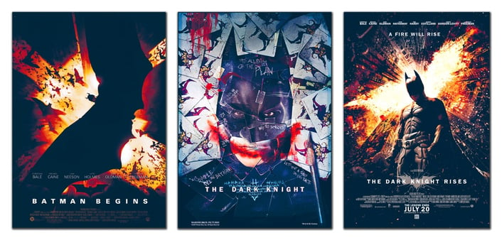
What is interesting about the Superhero genre is that once a character is established, what new things can be said about them? Especially in the static form of a poster? For example: we've seen Batman go through several iterations and reboots, from the gothic turns of Tim Burton's early films, to the campy and colourful Joel Schumacher double (we will never forgive you for this). However, the 2000's heralded the arrival of the definitive superhero movie series, Christopher Nolan's The Dark Knight Trilogy. The issue for Nolan and his marketing team was not only how he was to reimagine Batman, but also then maintain this stylistic choice across the three franchises whilst demarcating the individual instalments. See below how Nolan chose to evolve his Batman (across a trilogy which depicts The Dark Knight in a realistic, very un-comic-like setting).
The sepia tones of the first poster imply the end of the day, after which night reigns. Not only the time of the bat, but also of fear and horror. This is enhanced by the menacing swirl of bats, suggesting that the movie will focus on the psychological factors important in Batman's backstory, such as his battle against his personal fear (and the main villian, Scarecrow). The second movie's poster again plays upon the idea of fear, but the erratic falling of cards sets us up for an unpredictable antagonist. A development of the psychological themes of the first movie. Then for the final film, The Dark Night Rises, we see a city on fire (the burning oranges possibly coming full circle to the sepia tones of the first movie? A hint of a sunrise - the ending of the night?). Batman stands in the foreground, head downcast as if the destruction is weighing upon his back like Atlas. This suggests that Batman is not just warring on the streets but in his own mind, prompting questions about the burden of duty that often afflicts superheros. For me all three movies remain consistent in their portrayal of The Dark Knight Trilogy as a psychologically focussed trilogy of films, not only lending a unique flavour to this version of Batman, but also implying a sense of class to a genre previously considered only to be one dimensional.
What do you think, are my readings into the posters wrong? Let us know in the comments below.

Lest we forget, movie posters are created to serve one primary function: to advertise. The marketing fundamentals are rooted in the classic marketing acronym ‘AIDA’, which stands for ‘Attention, Interest, Desire, Action’, and describes the various stages of engagement a consumer might feel when faced with an ad.
Artists therefore are tasked with laying in the subtext such as described above, whilst also making the movies they represent look desirable. With superheroes that means adhering to certain tropes; for instance they know the poster will often be looked up at, so the protagonist's stance often accentuates this, being featured from a low point of view, making them seem to loom over the people below. These connotations of power are unavoidable in the superhero genre, such as pretty girls in rom-coms and explosions in action movies. It's the subtle balance of falling within expected parameters whilst simultaneously making their addition to that genre stand out that can be the challenge for movie poster artists. Often the visual identity of a poster is construed from things we know the audience thinks 'is cool', whilst remaining innovative. When it works, it can be incredible. This is why there are so many iconic images out there and I'm sure there are many people who have clear memories of the first memorable movie poster they saw. So arresting are the images on movie posters that we often see them on the walls of movie fans, in those contexts considered works of art themselves.
We have not even started to talk about how with internet culture, movie posters have taken on entirely new roles. Serving not only to spread viral interest but also lending assets to artists around the world, who without any other incentive other than wanting to create something they are proud of, frequently create fan made movie posters. Thus making their favourite superheros look cool as well as lending material to the social media campaigns of these popular movies.
Make sure you subscribe to our blog by entering your email into the box on the left. We'll be posting more blogs about superhero culture, as well as other articles on movies, fantasy art, gothic stories and much more.
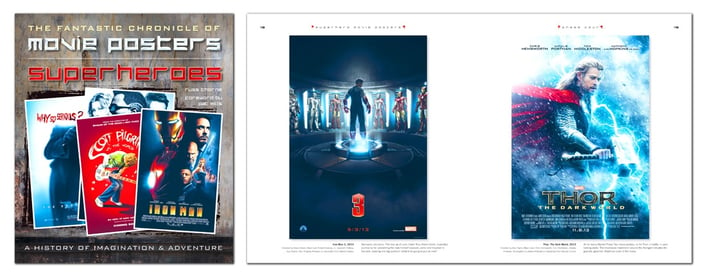
If you're a fan of all things comic-related, you'll love our book Superheroes Movie Posters: The Fantastic Chronicle of Movie Posters. Full of stunning movie poster for popular and niche superhero movies, this is a great gift for a comic lover, or even yourself! Take a closer look at the title here.
Links
- After the Superman V Batman trailer was leaked, we decided to take a look at some other interesting superhero crossovers.
- The same movie also prompted us to consider, are superhero movies overloaded with an abundance of male characters?
- But with great power comes... you know. Click here for our blog discussing whether an excess of power always leads to a dystopian future.


